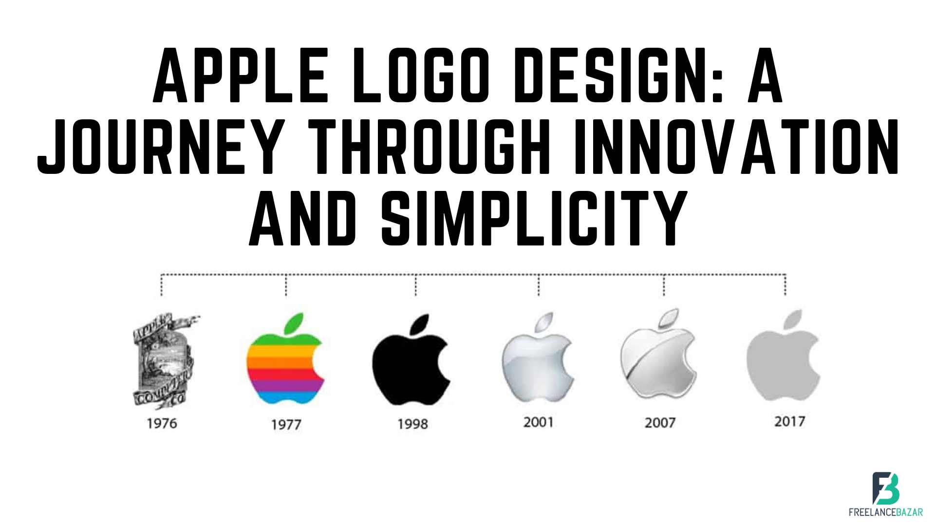
When you think of Apple, one of the first things that come to mind is its iconic logo. Simple, sleek, and instantly recognizable, the Apple logo has become a symbol of innovation and style. But do you know the story behind its evolution? In this blog, we will take a journey through the history of Apple logo designs, exploring the inspiration, transformations, and significance of each iteration. From the colorful stripes of the early days to the minimalist silhouette we know today, let's delve into the fascinating world of Apple logo design.Get a unique and professional logo design for your brand with Freelancebazar. Our custom services ensure a one-of-a-kind design for your business.
The Birth of the Apple Logo
In 1977, when Steve Jobs and Steve Wozniak incorporated Apple Computer Inc., they needed a logo to represent their brand. Rob Janoff, a young graphic designer, was tasked with creating a logo that would embody Apple's vision of simplicity and creativity. The result was the first Apple logo, known as the "Rainbow Apple."
The Rainbow Apple featured a multicolored apple with a bite taken out of it, adorned with rainbow-colored stripes. The vibrant stripes symbolized the Apple II computer's ability to display color graphics, setting Apple apart from its competitors. It also represented the company's values of diversity and inclusivity.
Transition to the Monochrome Apple
As Apple grew in popularity and expanded its product line, the company felt the need for a more streamlined and modern logo. In 1998, Apple introduced the "Monochrome Apple" logo, also known as the "Aqua logo."
Designed by the agency TBWA/Chiat/Day, the Monochrome Apple featured a single-color silhouette of an apple with a sleek, chrome-like finish. The bite remained, but the rainbow stripes were eliminated, giving it a more minimalist and sophisticated look. This change reflected Apple's evolving design language, emphasizing simplicity and elegance.
The Birth of the Apple Logo
In 1977, when Steve Jobs and Steve Wozniak incorporated Apple Computer Inc., they needed a logo to represent their brand. Rob Janoff, a young graphic designer, was tasked with creating a logo that would embody Apple's vision of simplicity and creativity. The result was the first Apple logo, known as the "Rainbow Apple."
The Rainbow Apple featured a multicolored apple with a bite taken out of it, adorned with rainbow-colored stripes. The vibrant stripes symbolized the Apple II computer's ability to display color graphics, setting Apple apart from its competitors. It also represented the company's values of diversity and inclusivity.
The Evolution of the Monochrome Apple
As Apple grew in popularity and expanded its product line, the company felt the need for a more streamlined and modern logo. In 1998, Apple introduced the "Monochrome Apple" logo, also known as the "Aqua logo."
Designed by the agency TBWA/Chiat/Day, the Monochrome Apple featured a single-color silhouette of an apple with a sleek, chrome-like finish. The bite remained, but the rainbow stripes were eliminated, giving it a more minimalist and sophisticated look. This change reflected Apple's evolving design language, emphasizing simplicity and elegance.
The Birth of the Apple Logo
In 1977, when Steve Jobs and Steve Wozniak incorporated Apple Computer Inc., they needed a logo to represent their brand. Rob Janoff, a young graphic designer, was tasked with creating a logo that would embody Apple's vision of simplicity and creativity. The result was the first Apple logo, known as the "Rainbow Apple."
The Rainbow
Apple featured a multicolored apple with a bite taken out of it, adorned with rainbow-colored stripes. The vibrant stripes symbolized the Apple II computer's ability to display color graphics, setting Apple apart from its competitors. It also represented the company's values of diversity and inclusivity.
The Evolution of the Monochrome Apple
As Apple grew in popularity and expanded its product line, the company felt the need for a more streamlined and modern logo. In 1998, Apple introduced the "Monochrome Apple" logo, also known as the "Aqua logo."
Designed by the agency TBWA/Chiat/Day, the Monochrome Apple featured a single-color silhouette of an apple with a sleek, chrome-like finish. The bite remained, but the rainbow stripes were eliminated, giving it a more minimalist and sophisticated look. This change reflected Apple's evolving design language, emphasizing simplicity and elegance.
The Arrival of the Apple Logo
In 2001, Apple introduced the "Glass Apple" logo, marking another significant shift in its design approach. Created by the agency IconFactory, this logo featured a more realistic and three-dimensional glass apple, giving it a reflective and glossy appearance. It aimed to represent Apple's commitment to technological advancements and cutting-edge design.
The Modern Apple Logo
The modern Apple logo, introduced in 2007, is a refinement of the previous designs. It retains the monochrome silhouette of an apple with a bite taken out of it but adopts a flatter, minimalistic style. The clean lines and absence of shading or gloss reflect Apple's design philosophy, which focused on simplicity and elegance.
Conclusion
The evolution of the Apple logo showcases the company's commitment to innovation, simplicity, and timeless design. From the vibrant and symbolic Rainbow Apple to the sleek and minimalistic Monochrome Apple, each iteration reflects Apple's growth, changing trends, and technological advancements. The logo has become a visual representation of the company's brand identity and a symbol recognized worldwide. As Apple continues to push boundaries and shape the future, the Apple logo stands as a reminder of the company's journey from its humble beginnings to its position as a global technology leader.
Get a unique and customized Logo Design service from Freelancebazar. Stand out with a professional logo designed just for you. Contact us now!


