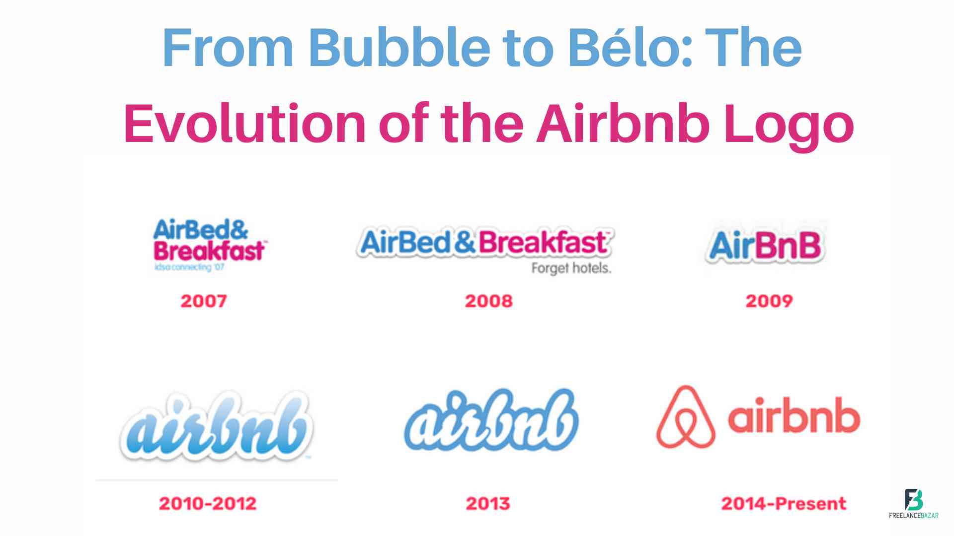
A brand's logo is a visual representation of its identity and values. It serves as a powerful tool for recognition and communication. One brand that has undergone a notable logo transformation is Airbnb. From its humble beginnings as a startup to becoming a global hospitality giant, Airbnb's logo has evolved significantly over the years. In this blog post, we will dive into the fascinating journey of the Airbnb logo, exploring its various iterations, symbolism, and strategic considerations behind each redesign. Join us as we uncover the story behind the iconic bubble logo and the introduction of the now-famous Bélo.
The Birth of the Bubble
When Airbnb was founded in 2008, it needed a logo that could capture the essence of its brand—the idea of sharing accommodations and connecting people worldwide. The original logo featured a lowercase wordmark with a blue bubble incorporated into the letter "a." The bubble symbolized the joy of travel, the spirit of exploration, and the sense of community that Airbnb sought to foster.
Introducing the Bélo
In 2013, Airbnb decided to revamp its logo to better represent its evolving mission and values. The result was the introduction of the Bélo, a new symbol designed to embody belonging, love, and the spirit of hospitality. The Bélo combined the shapes of a heart, a location pin, and the letter "A" into a single, cohesive mark. It was a visual representation of the connection and sense of belonging that Airbnb aimed to create among hosts and guests.
The Simplification and Adaptability
After the initial introduction of the Bélo, Airbnb received mixed reactions from the public. Some found the logo complex and hard to decipher. As a result, in 2014, Airbnb decided to simplify the design while retaining its core elements. The simplified Bélo featured a single color and eliminated the gradient, creating a flatter and more minimalistic look. The font was also softened, giving the logo a friendlier and approachable vibe. This redesign aimed to create a more versatile logo that could adapt to various contexts and backgrounds.
Sub-Logos for Different Services
As Airbnb expanded its services and offerings, it introduced sub-logos for specific initiatives, such as Airbnb Experiences and Airbnb Plus. These sub-logos incorporated variations of the Bélo symbol combined with the respective service names. The goal was to maintain brand consistency while distinguishing different facets of the Airbnb experience.
The Global Impact
Over time, the simplified Bélo became widely recognized and associated with Airbnb's brand. Its adaptability and simplicity made it versatile across various platforms, from digital to print media. The logo became a global symbol of hospitality and a testament to the brand's growth and influence in the travel industry.
Conclusion
The evolution of the Airbnb logo tells a story of a brand's growth, adaptation, and commitment to its core values. From the original bubble logo, representing the joy of sharing and community, to the introduction of the Bélo, embodying belonging and love, Airbnb's visual identity has evolved in alignment with its expanding mission. The simplification of the Bélo ensured its versatility and recognition across different contexts, solidifying Airbnb's place as a global hospitality giant. The logo's journey is a testament to the importance of a well-crafted visual identity and its ability to communicate a brand's values and resonate with its audience.


