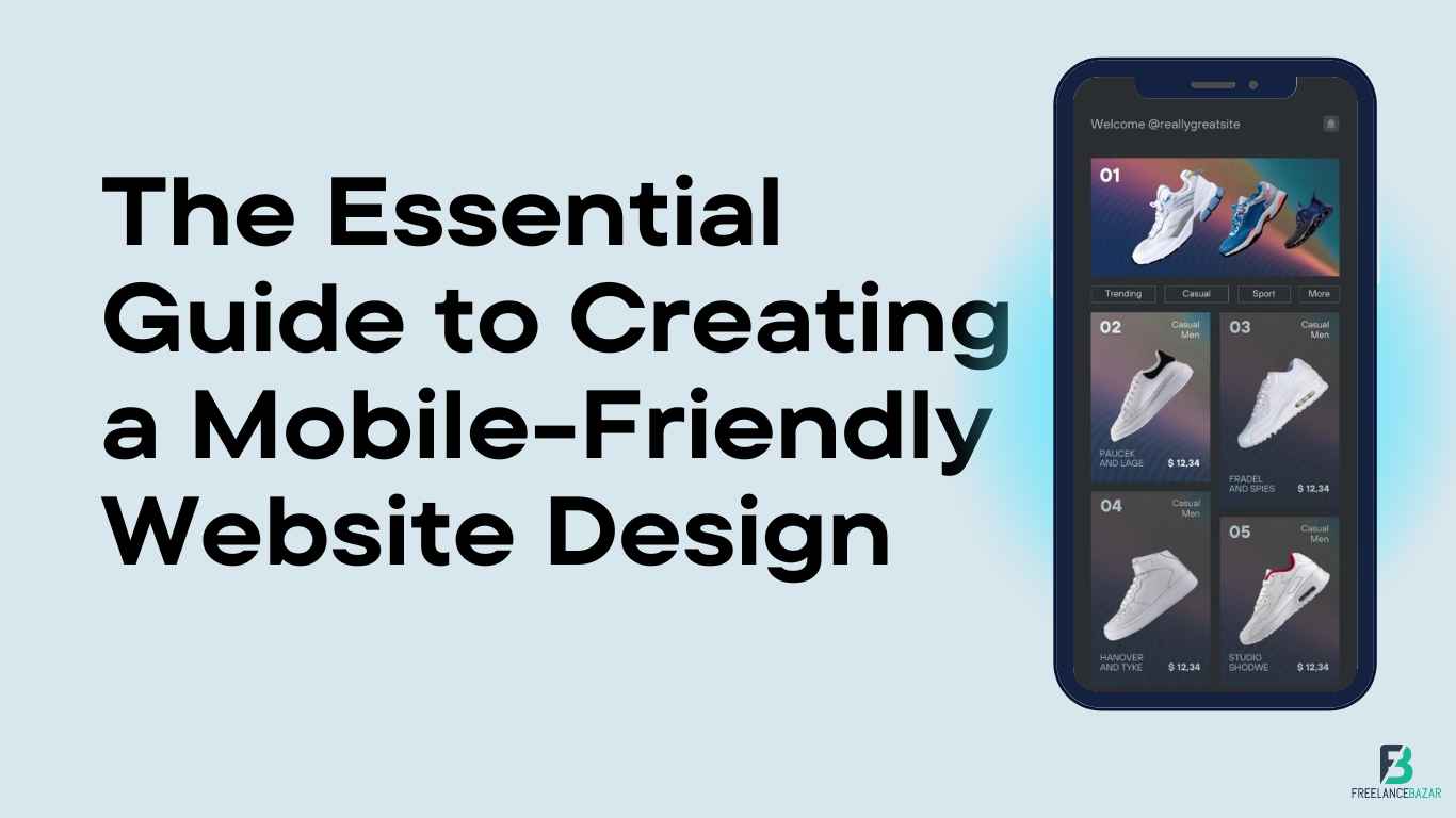
Mobile-friendly website design is becoming increasingly important in the digital world. With more people using their mobile devices to access websites, having a website that is designed to be easy to use and optimized for mobile devices is essential. Freelancebazar has a range of services that you can use to design a website to be easy to use and optimized for mobile devices.
A mobile-friendly website design should prioritize the mobile browsing experience by making sure that all content, images, forms, and videos are accessible on any device. It also should be responsive so that it adapts to different screen sizes and orientations. Additionally, a well-designed mobile website will load quickly and have minimal loading times so that users can easily navigate and find what they need quickly.
What is a Mobile-Friendly Website and Why Is It Important?
In today's digital world, having a mobile-friendly website is essential for businesses that want to reach their target audience. Good design keeps users coming back. And good, user-friendly design for mobile devices is crucial for ensuring a great web experience. It ensures that the website is optimized for any device and provides an optimal user experience.
The design of a mobile-friendly website involves responsive web design, which allows the page layout and elements to adjust according to the screen size of the device being used. Additionally, there are certain design tips that should be followed when creating a mobile website such as keeping menus short and sweet, using larger font sizes, optimizing images for mobile devices, and more.
In today's increasingly mobile world, having a website that is not optimized for viewing on mobile devices could be quite the problem. Not only is it inconvenient, but it can also result in lower rankings in search engine results pages (SERPs) and therefore fewer potential customers visiting your website. Freelancebazar's mobile-friendly website design will let you create a beautiful website that is very easy to use and optimized for mobile devices.
Tips for Optimizing Your Mobile Site for Faster Performance
The performance of your mobile site is paramount to your success in the digital landscape. With an increasing number of users accessing the web on their phones, it is important that you optimize your mobile site for faster performance. There are several tips and tricks you can use to increase page loading speed and improve website performance on mobile devices. In this article, we will discuss some effective ways to optimize your mobile site for faster performance so that you can keep up with the competition. Freelancebazar offers a mobile-friendly website design that is easy to use and available as a solution for small businesses.
How to Choose the Right Design Layout for Your Mobile Site
Choosing the right design layout for your mobile site is essential for providing an optimal user experience. The layout should be easy to navigate, provide quick access to the content and enable easy interaction with the site. It is important to consider the screen sizes of different devices and make sure that the design is responsive. Selecting a responsive layout ensures that users can access your website from any device, regardless of screen size or platform. When selecting a design layout, it is important to consider how it will affect usability, loading speed, and overall user experience. By taking all these factors into consideration, you can choose a best-in-class mobile site design that provides an optimal user experience for visitors.
What Are the Best Practices for Creating a Mobile Friendly Website?
With the rapid rise of mobile users, creating a mobile-friendly website is essential for businesses to stay competitive. To ensure that your website is optimized for mobile, there are some best practices you should consider. These include making sure that your website layout is responsive, optimizing images and videos for mobile devices, and ensuring that all content is easily accessible on all devices. Freelancebazar offers cheap and affordable mobile-friendly website design services that make marketers stand out.
Additionally, it's important to check the loading speed of your pages and make sure that they are optimized for different screen sizes. By following these best practices, you will be able to create an enjoyable user experience on any device and make sure that your customers have access to the information they need when they need it.
Tips on Making Your Content More Accessible on Different Devices
As we increasingly rely on technology, we need to make sure that our content is accessible across all devices. This means that it should be displayed correctly on any device and should be easy to read and understand regardless of the user's screen size, device type, or browser.
In this article, we will look at some tips on how to make your content more accessible across different devices. We will discuss the importance of creating responsive designs, optimizing images for maximum compatibility, and making sure that the content is optimized for fast loading times. By following these tips, you can ensure that your content is available and usable for everyone who visits your website or app.
Conclusion
With the ever-increasing growth of global mobile traffic, it is clear that mobile website browsing is the future of digital content consumption. Smartphone and tablet users are increasingly using their devices to access websites on the go and to stay connected with their favorite brands, products, and services. This shift in browsing habits has put tremendous pressure on website owners to optimize their websites for smaller devices, while still delivering an optimal user experience.
As such, businesses must consider how they can utilize this growing trend by creating mobile-friendly websites that offer a more engaging experience for visitors. By doing so, they can ensure that their websites remain competitive in an ever-changing digital landscape. Freelancebazar offers a refreshingly simple website design centered on your mobile users--putting your brand in their hands.