Brand identity is the unique essence that distinguishes a company or product from its competitors. It encompasses a set of visual, auditory, and experiential elements that collectively form a distinct personality and perception in the minds of consumers. This identity is carefully crafted through deliberate choices of elements such as logos, color schemes, typography, messaging, and even the overall customer experience.
A well-defined brand identity serves as a powerful communication tool, conveying not only what a brand offers but also its values, mission, and the emotions it seeks to evoke. It acts as a bridge between the brand and its audience, creating a sense of familiarity and trust. Consistency in brand identity across all touchpoints is key, as it reinforces the brand's message and helps consumers build a strong mental association. For instance, the iconic swoosh of Nike instantly evokes a sense of athleticism, innovation, and empowerment. Similarly, the golden arches of McDonald's are globally recognized, representing a promise of quick, accessible, and familiar fast food.
A well-crafted brand identity not only attracts customers but also fosters brand loyalty. It becomes a shorthand for the brand's values and promises, making it easier for consumers to connect emotionally and make purchasing decisions. Ultimately, a strong brand identity is a valuable asset that can significantly impact a company's success and longevity in the marketplace. In the dynamic world of marketing and branding, colors play a pivotal role in shaping brand identity. The evolution of colors in branding is a fascinating journey that spans centuries, reflecting shifts in culture, psychology, and technology. This article delves into the history of colors in branding and explores how they are utilized today to create powerful brand identities.
The Early Beginnings
Colors have been a part of human communication long before the advent of branding. Ancient civilizations used natural pigments to decorate their surroundings, convey messages, and symbolize status. For example, in ancient Egypt, red ochre represented life and vitality, while blue was associated with the divine. These early uses of color laid the foundation for their symbolic significance. Turn your imagination into an unforgettable emblem: Exceptional Custom Brand Identity Services offered by Freelancebazar. Elevate your business with bespoke branding solutions tailored to your unique identity. Stand out in the market with expertly crafted logos, visuals, and messaging.
The Industrial Revolution: A Technicolor Revolution
The Industrial Revolution marked a significant turning point in the way colors were produced and perceived. With the advent of synthetic dyes, a wide spectrum of colors became accessible to a broader audience. This newfound abundance of colors allowed businesses to experiment with their brand identities.
During this period, iconic brands like Coca-Cola introduced their signature red and white combination, creating an instantly recognizable visual identity. This choice of colors was strategic; red exudes energy and passion, while white provides contrast and balance.
Psychology of Colors
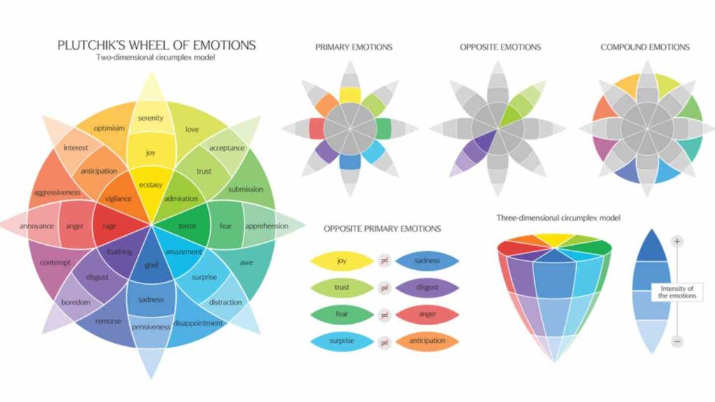
As psychology emerged as a formal discipline, researchers began to investigate the impact of colors on human emotions and behaviour. This led to the development of color psychology, which studies how different colors evoke specific emotional responses.
For example, blue is often associated with trust, stability, and professionalism, making it a popular choice for financial institutions and technology companies. Meanwhile, green signifies growth, health, and nature, making it a common choice for eco-friendly and health-related brands.
The Digital Age: A Colorful Revolution
The digital age brought about a new dimension to color usage in branding. The emergence of high-quality displays allowed for more vibrant and nuanced representations of colors. This, coupled with the proliferation of social media and e-commerce platforms, amplified the importance of a consistent and appealing visual brand identity.
Brands like Google and Microsoft adopted vibrant, multi-colored logos to convey innovation, diversity, and approachability. These logos are not only visually striking but also represent the diversity of services and products these tech giants offer.
Beyond Borders: Cultural Significance of Colors
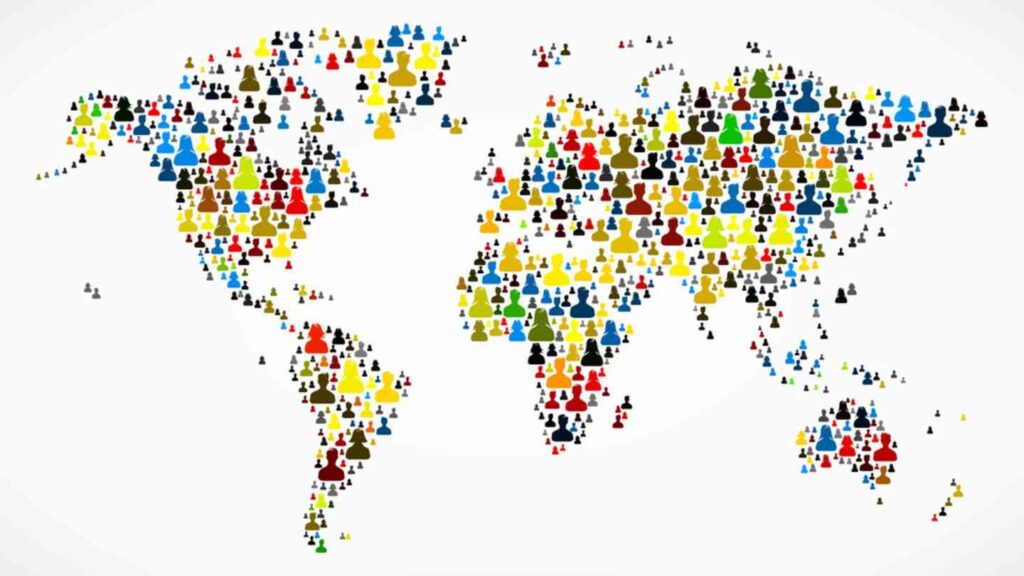
As businesses expanded globally, the cultural significance of colors became a crucial consideration in branding. Colors can convey different meanings in various cultures, and understanding these nuances is essential to avoiding unintentional misunderstandings.
For instance, in Western cultures, white often symbolizes purity and simplicity, whereas in some Eastern cultures, it is associated with mourning. A brand that is sensitive to these cultural differences can build a more inclusive and respectful image.
Brand Identity through Color Consistency
Consistency in color usage is a cornerstone of effective brand identity. When customers consistently encounter specific colors associated with a brand, it creates a strong mental association. This phenomenon, known as the "mere exposure effect," leads to increased brand recognition and trust.
For instance, think of the distinct shade of brown associated with UPS or the vibrant red synonymous with Coca-Cola. Each brand has intertwined itself with these particular colors, making them impossible to think of apart. Case Studies: Successful Use of Colors in Branding
1. Apple:
Apple's sleek and minimalist aesthetic is reinforced by its monochromatic logo. The silver apple with a bite taken out of it has become an iconic symbol of innovation and sophistication.
2. McDonald's:
The bright yellow and red colors used by McDonald's are chosen for their ability to evoke feelings of warmth, happiness, and excitement, creating a cheerful and inviting atmosphere. Enhance your brand's reputation by utilizing FreelanceBazar's tailored solutions for brand identity. Transform your business into a memorable brand with our tailored design services. Discover the power of a unique identity that sets you apart.
3. Starbucks:
The rich green associated with Starbucks is not only a nod to their coffee origins but also signifies growth, health, and sustainability, aligning with their commitment to ethical sourcing.
Conclusion
The evolution of colors in branding is a testament to the ever-changing landscape of culture, psychology, and technology. From the ancient use of natural pigments to the digital explosion of vibrant hues, colors continue to be a powerful tool in creating memorable brand identities. Understanding the psychological and cultural nuances of color choices is paramount for businesses looking to establish a strong and lasting presence in the minds of consumers. By leveraging the psychology of colors and maintaining consistency in their usage, brands can create a visual language that resonates with their audience and stands the test of time.